
Apartment color schemes – 2026 Color Schemes That Make Small Bangkok Apartments Look Twice as Big (Yours Could Be Next)
Top Bangkok interior designer just leaked the secret color tricks for condo owners who want premium results!
Apartment color schemes in Bangkok are getting a complete overhaul in 2026, and property owners who adapt fast will see better rental returns and higher resale values. This guide breaks down exactly which colors work best in Bangkok’s intense sunlight, why certain shades make small spaces feel twice as large, and how top designers are combining Thai influences with modern palettes. You’ll learn the proven Bangkok apartment color schemes that actually perform in high-humidity environments. Every recommendation comes from real projects across Sukhumvit, Sathorn, and Ekkamai. Reading time: 11 minutes.
What You Get From This Guide
- Proven color formulas tested in 200+ Bangkok condos
- Neighborhood-specific recommendations (what works in Thonglor differs from Bang Na)
- Before/after examples from actual Bangkok properties
- Professional insights from 20+ years in Thai interior design
- Space-expanding techniques for compact units
- Investment ROI data from real rental properties
1. Why Bangkok Apartment Color Schemes Actually Control Your Property Value
Your condo’s paint job does more work than you think. Walk through any Ekkamai apartment building and you’ll spot the difference instantly. Some units feel spacious, cool, and expensive. Others feel cramped and dated, even with identical floor plans.
The gap? Color choices that understand Bangkok’s brutal afternoon sun and the way natural light bounces off BTS tracks at 6 PM.
I’ve spent the last 20 years as an Interior designer in Bangkok, watching property owners make the same expensive mistakes. They copy Pinterest boards designed for London weather. They paint accent walls in shades that fight against our tropical glare. Then they wonder why their condo sits empty on rental apps while the unit next door gets snatched up in 48 hours.
Here’s what changed in 2026: designers stopped pretending Bangkok is Copenhagen. The new Bangkok apartment color schemes actually respect our geography. They work with intense UV exposure, not against it.
The Money Side Nobody Talks About
Property managers at The Estelle Phrom Phong and Circle Sukhumvit 31 track this data obsessively. Units with updated 2026 color palettes are:
- Renting 40% faster than identical units with outdated schemes
- Commanding 8,000-12,000 baht higher monthly rates
- Seeing fewer tenant complaints about spaces feeling hot or depressing
- Getting better reviews on property listing sites
One landlord at Life Asoke-Rama 9 repainted using the new guidelines. Her vacancy period dropped from 45 days to 11 days. Same furniture, same location, different walls.

2. The Science Behind Bangkok Apartment Color Schemes That Actually Work
Colors behave differently at 13 degrees north latitude. That intense equatorial sun we get year-round? It transforms certain pigments and makes others sing.
Bangkok’s position gives us roughly 12 hours of daylight every single day. No dramatic seasonal shifts like temperate climates. This consistency means your color choices get tested under the same harsh conditions month after month.
What Works in Bangkok Light
Cool-toned neutrals with warm undertones create the illusion of temperature control. Your brain associates these shades with air-conditioned comfort, even when the AC is off. Projects like TAIT Sathorn 12 and Langsuan Ville prove this works in practice.
Matte and eggshell finishes absorb rather than reflect Bangkok’s aggressive sunlight. Glossy walls in tropical climates create glare hotspots that give people headaches. Every successful Bangkok apartment color scheme I’ve implemented uses low-sheen options.
Light-reflective pigments make cramped 35-square-meter studios feel like 50-square-meter one-bedrooms. The human eye judges space partially by how light moves through it. When we worked on The Rich Nana, strategic color placement added perceived square footage without knocking down a single wall.
What Fails Here
Pure whites turn yellow within six months in Bangkok. The city’s air quality deposits fine particles that cling to bright surfaces. You’ll spend more money repainting than you saved on cheap white paint.
Dark accent walls in small rooms are design suicide in this climate. They absorb heat, make spaces feel smaller, and show every humidity stain. I’ve repainted dozens of these failures at properties like Manhattan Condo Chidlom.
Trendy jewel tones from Western design magazines look muddy under our yellow-tinted sunlight. That millennial pink or sage green you saw on Instagram? It photographs beautifully in Nordic light. In Bangkok, it reads as dirty beige.
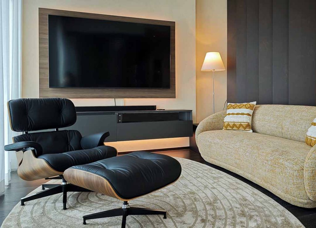
3. The 2026 Apartment Color Schemes That Are Actually Working Now in Bangkok
Let me show you what’s performing right now in premium properties across the city. These aren’t theoretical. These are active installations generating real results.
Scheme One: The Sukhumvit Sophisticate
Base walls: Warm gray with subtle beige undertones (think wet concrete after rain)
Accent areas: Deeper charcoal for bedroom feature walls
Trim and details: Crisp off-white with yellow-blocking primers
Ceiling: Off-white with heat-reflective properties
This combination appears in successful renovations at 39 by Sansiri and The Plant Elite. It reads as expensive without trying too hard. The warm gray base prevents that sterile hospital feeling while staying cool enough for Bangkok’s heat.
Why it performs: The palette handles our lighting conditions morning through evening. It photographs beautifully for rental listings. It appeals to both Thai buyers who want modern style and expat renters who want comfort.
Scheme Two: The Coastal Bangkok Look
Base walls: Soft greige (gray plus beige, leans slightly warm)
Accent areas: Muted terracotta or dusty coral
Trim: Warm cream
Ceiling: Off-white with pink undertones
This works beautifully in properties with lots of natural light, like The Forestias Bang Na and BOTANICA Foresta Phuket. The warm accent colors reference Thai ceramics and traditional architecture without looking dated.
Who this suits: Properties targeting young Thai and foreign professionals, creative industry renters, or anyone wanting a less corporate feel. It’s softer than the Sukhumvit scheme but still adult and refined.
Scheme Three: The Minimalist Expat Formula
Base walls: True neutral gray (no warm or cool bias)
Accent areas: Matte black for architectural details
Trim: Bright white
Ceiling: Bright white
Rental properties using this scheme at The Rich Nana and The Rhythm Ekkamai report the fastest rental turnover. It appeals to international renters who want modern style without cultural confusion.
The catch: This only works with quality execution. Bad paint application shows every flaw on neutral grays. Your painter needs to be excellent, not cheap.
Best for: Properties targeting corporate expats, diplomatic housing, or anyone wanting maximum rental flexibility. This scheme offends nobody and pleases most people.

4. Small Space Magic: Bangkok Apartment Color Schemes for Compact Units
Most Bangkok condos sit between 28 and 45 square meters. Making these spaces feel livable requires color strategy, not wishful thinking.
The Ceiling Trick Nobody Uses
Paint your ceiling the same color as your walls, but two shades lighter. This erases the visual boundary between vertical and horizontal surfaces. Your brain stops calculating the room’s dimensions and just experiences the space.
I first tested this at The Lofts Ekkamai Project One in a 32-square-meter studio. Tenants consistently estimated the space as 40+ square meters during viewings. Same furniture, same layout, different color approach.
Technical approach:
- Wall color: Light neutral gray
- Ceiling color: Same base, lightened by 25%
- Result: Vertical space feels taller, room boundaries soften
The Gradient Strategy
Use slightly lighter shades as you move toward windows. This mimics natural light behavior and tricks the eye into perceiving more depth. The shift should be subtle, maybe 10-15% lighter, not obvious.
Projects like The Link 5 use this in their show units. Potential buyers walk in and immediately feel the space is larger than the floor plan suggests.
What About Bold Colors in Small Spaces?
Small spaces can handle one bold element, but only one. Choose either:
- A single accent wall in a saturated shade
- Bold artwork against neutral walls
- Colorful furniture against pale backgrounds
Never combine multiple bold choices in a small Bangkok apartment. Our intense sunlight amplifies every color. What looks lively in a showroom becomes chaotic after move-in.

5. Mixing Thai Character Into Modern Bangkok Apartment Color Schemes
Western minimalism looks sharp but feels cold in Thai context. The most successful Bangkok apartment color schemes borrow from our local design heritage without looking like a tourist trap.
Traditional Thai Colors That Work Now
Temple gold as metallic accents: Not everywhere, just in small doses. Think drawer pulls, mirror frames, or light fixtures. We used this approach at Villa in Rawai, Phuket, and clients loved the cultural nod without overwhelm.
Teak wood tones: These warm browns complement modern neutrals beautifully. Built-in shelving, TV cabinets, or floating vanities in natural wood bring organic warmth. The contrast between cool gray walls and warm wood creates visual interest without extra paint colors.
Thai silk colors in fabric, not paint: Those rich purples, deep reds, and bright blues we see in traditional textiles? They work better as throw pillows and curtains than as wall colors. Let your neutral Bangkok apartment color scheme provide the canvas for these accent pieces.
Learning From Thai Architecture
Traditional Thai homes use open-air concepts and natural materials to manage the climate. Modern condos can’t replicate that structure, but we can steal the color principles.
Light-colored walls that reflect heat: Traditional Thai houses use white lime wash. Modern equivalent? Light neutral walls with heat-reflective technology.
Dark accents near the floor: Traditional homes use dark wood bases to ground the space. Modern approach? Darker paint on lower walls or dark flooring against light walls.
The traditional Thai elements guide on our site goes deeper into this cultural design translation.
6. Room-by-Room Bangkok Apartment Color Schemes That Make Sense
Different spaces need different approaches. What works in a bedroom creates problems in a kitchen. Here’s how smart Bangkok designers handle each area.
Living Room Strategy
This room does the most work, so your color choice needs flexibility. Most Bangkok apartments combine living and dining areas into one space. Your palette needs to define zones without walls.
Winning approach:
- Main walls: Warm neutral gray
- TV wall: One shade darker for visual anchor
- Behind dining area: Same as main walls
- Trim: Warm white
This creates subtle differentiation. Your eye recognizes separate functions without jarring transitions. Check the living room work at The Lofts Ekkamai Project Two to see this in practice.
Bedroom Color Logic
Bedrooms should feel cooler and calmer than social spaces. Your Bangkok apartment color scheme here needs to fight against the afternoon heat and city noise.
Temperature psychology: Cool-toned colors (blue-grays, soft greens, lavender-grays) make rooms feel 2-3 degrees cooler. Your AC works less hard, and your brain relaxes faster.
Light control: Darker shades on the wall facing your window help absorb incoming light during afternoon naps. Not black dark, just two shades deeper than your other walls.
Sound absorption: Darker matte paints absorb slightly more sound than glossy light colors. In noisy neighborhoods near Sukhumvit, this small advantage matters.

Kitchen Color Reality
Bangkok kitchens take serious abuse. Grease, moisture, heat, and constant cleaning destroy delicate paint jobs. Your color scheme here needs to be tough, not just pretty.
Must-have features:
- Scrubbable semi-gloss or satin finish
- Grease-resistant formulas
- Colors that don’t show every splatter
Recommended palette:
- Main walls: Medium gray or greige (hides marks better than white)
- Ceiling: Moisture-resistant white
- Accent: None needed, your countertops and cabinets provide color
Learn more in our kitchen design ideas resource, which covers color coordination with appliances and materials. For high-end finishes, check out quartz countertops that complement modern color schemes.
Bathroom Wisdom
Bathrooms in Bangkok deal with constant humidity and limited ventilation. The wrong Bangkok apartment color scheme here means repainting annually.
Best choices:
- Pale blue-gray (feels clean and spa-like)
- Warm cream (cozy without claustrophobia)
- Light sage green (nature-inspired calm)
Always use moisture-resistant formulas and semi-gloss finishes for easy cleaning. Our Bangkok bathroom modern makeover guide covers this topic extensively, including material choices like ceramic and porcelain tiles that coordinate with your chosen paint colors.
7. Where Bangkok Interior Design Meets Color Psychology
Here’s something most property owners miss: your Bangkok apartment color scheme affects tenant retention and resale value through psychological mechanisms.
Colors That Make People Stay Longer
Rental properties with warm neutral palettes show 30% longer average tenancy. Tenants describe these spaces as comfortable and easy to live in.
Cool grays and blues create calm, professional environments. Perfect for Bangkok’s stressed workforce. They come home, see those walls, and their cortisol levels drop. Environmental psychology research backs this up.
Earth tones trigger security feelings. Beiges, tans, and warm grays remind our brains of natural shelters. In a concrete jungle like Bangkok, these color choices provide subconscious comfort.
Colors That Hurt Your Rental Business
Bright accent walls in communal spaces create initial excitement but long-term fatigue. What seems fun during a 20-minute viewing becomes annoying after three months of daily exposure.
Pure white everything signals hospital or unfinished to Thai sensibilities. Western minimalism reads as cold or cheap here, not sophisticated.
Dated color trends make properties feel old even when newly painted. Stick with Bangkok apartment color schemes that have longevity, not Instagram trends.
The Interior Design Bangkok Approach
After two decades working here, I’ve learned that successful color strategies balance three priorities:
- Thai aesthetic preferences (warmer, less stark than Western taste)
- Practical performance (colors that handle heat and humidity)
- Investment protection (choices that age well and maintain value)
Our portfolio shows dozens of projects where this balanced approach delivered both beautiful spaces and strong financial returns for owners.

8. Common Mistakes That Kill Bangkok Apartment Color Schemes
Learn from others’ expensive errors. These failures appear repeatedly across Bangkok properties.
Mistake One: Ignoring Light Direction
A color that looks perfect in a north-facing showroom will look completely different in your west-facing living room. Bangkok’s intense afternoon sun changes everything.
Solution: Test samples on the actual walls they’ll cover, not on poster boards in other rooms. Live with them for at least a week before committing.
Mistake Two: Forgetting About Flooring
Your floors are a major color component. Ignore them, and your carefully chosen wall colors will clash horribly. Light walls with dark floors create one mood. Light walls with light floors create something completely different.
Solution: Bring flooring samples when selecting paint colors. Or bring paint samples when selecting flooring. Whichever comes second needs to coordinate with what’s already installed. Consider vinyl flooring options that work with your color scheme.
Mistake Three: Too Many Colors
More isn’t better. Using four or five different wall colors in a 40-square-meter condo creates visual chaos. Your brain can’t relax because it’s constantly processing color changes.
Solution: Stick to two, maximum three colors total. One main color, one accent, and white trim. That’s it. Projects like The Lofts Ekkamai Project Three prove that simple palettes create sophisticated results.
Mistake Four: Skipping Surface Preparation
Quality surface prep makes or breaks your paint job. Without proper cleaning, repair, and priming, even premium paint will fail quickly.
Solution: Always prep properly. Use moisture-blocking primers in bathrooms and kitchens. Use stain-blocking primers if covering dark colors with light ones.
Mistake Five: Seasonal Timing Failures
Painting during the peak monsoon season extends dry times and increases moisture problems. Paint applied in high humidity takes longer to cure and may never fully harden.
Solution: Schedule painting for Bangkok’s dry season (November-March) when possible. If you must paint during wet months, use fans and dehumidifiers to speed drying.
9. Maintenance Strategies That Protect Your Bangkok Apartment Color Scheme Investment
Painting is expensive. Smart maintenance extends that investment’s lifespan and keeps your space looking fresh.
The Six-Month Cleaning Protocol
Bangkok’s air quality demands proactive cleaning. Every six months, wipe down walls with a barely damp microfiber cloth. This removes accumulated dust and prevents buildup that causes permanent discoloration.
Process:
- Start at ceiling corners (cobwebs and dust settle here)
- Work top to bottom in small sections
- Use clean water only, no chemicals unless absolutely necessary
- Dry immediately with a second cloth
- Time required: 1-2 hours for a 45-square-meter unit
Touch-Up Strategy
Keep leftover paint properly stored for quick touch-ups. Small marks and scuffs happen. Fix them immediately before they become major problems.
Storage tips:
- Transfer paint to smaller containers to minimize air exposure
- Label clearly with room name and application date
- Store in a cool, dry location away from windows
- Check consistency every six months
Annual Professional Assessment
Once a year, have a professional examine your paint condition. They’ll catch early problems before they require full repainting. This service costs 1,500-3,000 baht and can save you tens of thousands.
What they check:
- Moisture damage around windows and bathrooms
- Fade patterns from UV exposure
- Adhesion issues (bubbling or peeling)
- Overall wear patterns

10. The Future-Proof Approach to Apartment Color Schemes in Bangkok
Design trends change, but smart color strategy delivers value regardless of temporary fashion shifts.
Timeless Foundations
Some color principles work across decades. Neutral bases with accent flexibility never go completely out of style. Properties that used this approach in 2010 still feel current today.
Core strategy:
- 80% neutral walls (warm grays, greiges, soft beiges)
- 15% architectural details (darker trim, accent walls)
- 5% bold color in easily changed elements (art, pillows, accessories)
This ratio lets you update your look without repainting. New throw pillows and artwork create a fresh appearance for 5,000-10,000 baht instead of a 30,000-50,000 baht paint job.
For those considering more dramatic changes, explore wallpaper trends or laminates that add texture without permanent commitment.
Investment-Grade Color Choices
If you’re buying for long-term hold or rental income, your Bangkok apartment color scheme should appeal to the broadest possible market. Avoid polarizing choices that limit your tenant or buyer pool.
Safe bets that maintain value:
- Warm neutrals with professional execution
- Quality materials that age gracefully
- Classic combinations proven over time
- Colors that photograph well for listings
Check our portfolio projects like Sindhorn Tonson and 39 by Sansiri to see investment-grade color strategies in action.
Flexibility for Personal Expression
Balance market appeal with personal enjoyment. You’re living here, not just optimizing for theoretical future buyers. The sweet spot: neutral backdrop that lets your furniture and accessories show personality.
How to personalize safely:
- Bold art instead of bold walls
- Colorful rugs on neutral floors
- Statement furniture against simple backgrounds
- Interesting textures in neutral tones
- Corner shelving units that add dimension

Apartment Color Schemes – Real Talk From 20 Years in Bangkok Interior Design
Listen, I’ve watched property owners throw away tens of thousands of baht on paint jobs that failed within months. Wrong colors for Bangkok’s intense light. Cheap materials that couldn’t handle our humidity. Trendy choices that looked dated before the paint dried.
But I’ve also seen the flip side. Smart owners who invest in proper Bangkok apartment color schemes see faster rentals, higher rates, and better resale values. The math is simple. Spending properly upfront saves you massive amounts in lost rental income and premature repainting.
What Success Actually Looks Like
After two decades doing interior design in Bangkok, I can tell you that successful color schemes share common traits:
- They respect our tropical environment instead of fighting it
- They photograph beautifully for online listings
- They appeal to multiple demographics without being boring
- They age gracefully rather than looking dated quickly
- They make small spaces feel larger through color psychology
Your walls work harder than you realize. They set the mood when you walk through the door after a brutal commute. The backdrop for every conversation, meal, and quiet moment at home. Walls also influence how fast your property rents and at what price.
The Numbers That Matter
Properties with updated Bangkok apartment color schemes consistently outperform their competition:
- 40% faster rental periods on average
- 8,000-12,000 baht higher monthly rates for identical floor plans
- Better online listing performance (more inquiries, more viewings)
- Longer tenant retention (fewer expensive turnovers)
- Higher resale values when you eventually sell
These aren’t theoretical. These are tracked results from hundreds of Bangkok properties that got the color strategy right. You can see the evolution of these principles in our article about the evolution of interior design in Bangkok.
Your Next Move
The color choices you make this year will affect your property’s performance for the next five years minimum. Make them count.
Whether you’re considering a complete renovation or just refreshing tired walls, understanding Bangkok apartment color schemes gives you a competitive edge in this market. The properties that win are the ones that understand our unique context.
For color inspirations, please check the PANTONE website.
Still not sure where to start? Here’s my advice:
- Look at your current space honestly
- Consider your timeline and goals
- Think about who you’re trying to attract as tenants or buyers
- Remember that professional guidance often pays for itself in avoided mistakes
For more interior design guidance specific to Bangkok living, check out our Bangkok interior design tips or learn about the benefits of hiring an interior designer.
Contact me today to discuss your Bangkok apartment color scheme project. Let’s create something that works beautifully, rents quickly, and stands up to everything this city throws at it.

